Wednesday, September 28, 2011

Design Development One

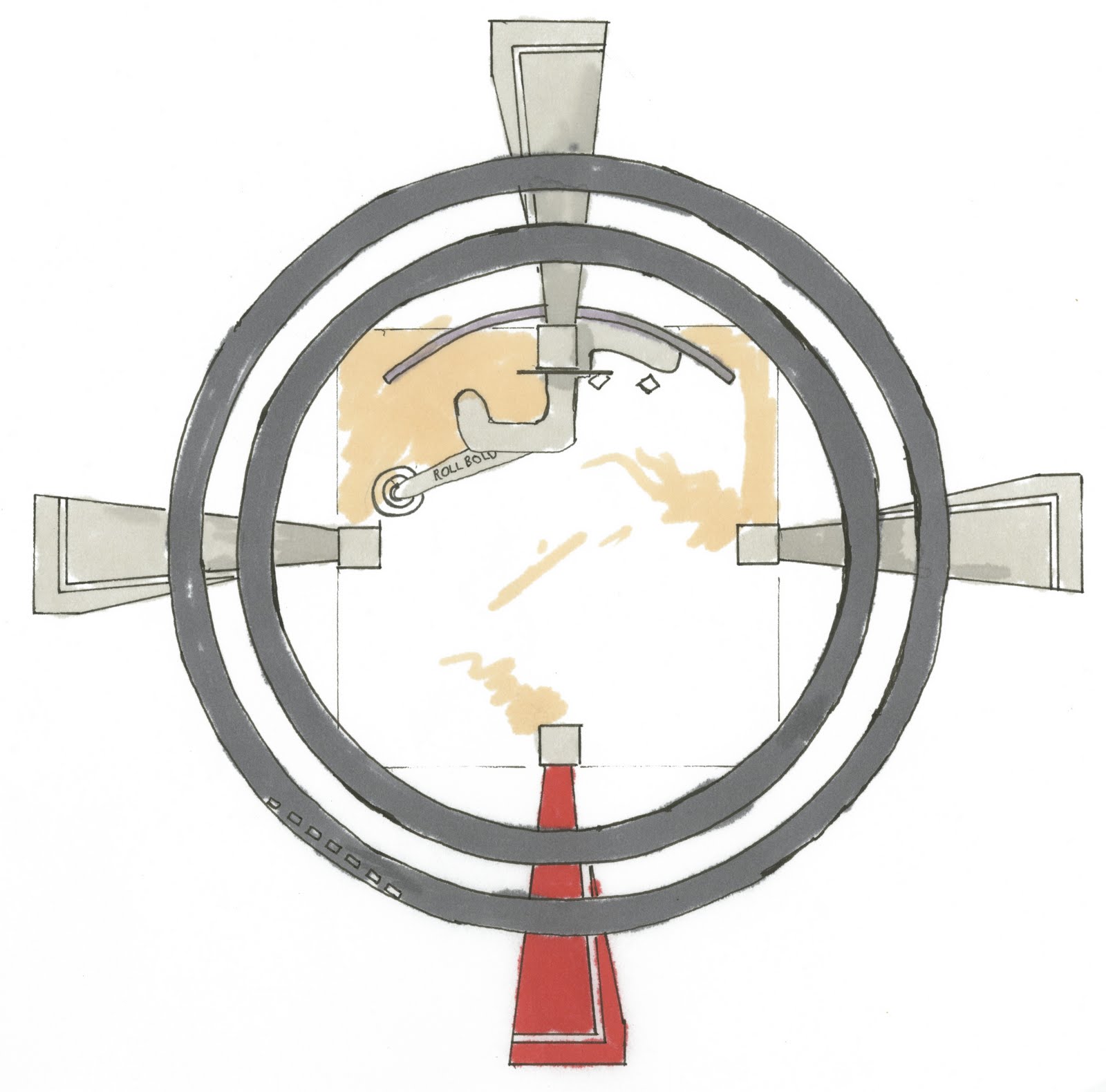
The concept of "Broadcast" is about generating interest in select SEPHORA products. "Broadcast" spoke to me as a concept because I see it as rays that break off from an origin point to influence their environment in various ways. I imagine the pop up store reaching out to recreational shoppers while still pointing them to companion SEPHORA stores nearby. Broadcast rings within a radar system floating out are seemingly weightless, much like the way makeup should make one feel. The shop is open with large mannequins that show the products in theatrical and provocative ways so as to engage the shopper in an entertaining experience. The openness of the layout allows customers to easily get the big idea of what the space is about as well as enabling easy access to the products.

Merchandise is to be out and open for testing. The mannequins stretch out gesturing for their products to be tested. Client/customers enter from all sides as the store is located along major walking throughways. The cash wrap and beauty station are located next to each other as they are both "grounded" with a major column. Products will be displayed with the mannequins, columns, as well as curtain units that travel along tracks underneath the main structure's broadcast rings.

The space will be primarily white with black accents and more minimal red accents. The red will be used to play up key elements such as the mannequins and column components. The heavy use of white is broken up through the use of different textured and patterned materials. White Kirei wood will is used in horizontal applications as its visual texture is very layered much like the SEPHORA brand design.

Schematic Design : SEPHORA BROADCAST


SEPHORA BROADCAST is a pop up retail installation that functions as a companion store to nearby SEPHORA stores. It serves to broadcast popular and anticipated products by SEPHORA and its partners within the framework of theatricality and drama.

Broadcast is made up of modular column units arranged in a cardinal orientation. The columns are dedicated to the showcasing of select fragrance, skincare, color, and hair products. The theatrical nature of SEPHORA’s composition extends to the illuminated cast members who serve as display/beauty station units. The illuminated cast members sport the products in a provocative manner, providing a fresh experience for the consumer/ client.

Broadcast travels to popular outdoor locations around Miami, Fl. rife with color and liveliness. As an outdoor pavilion, Broadcast is open and inviting to the public.


Thursday, September 1, 2011

Geeked Out Over Battlestar Galactica


I recently got a Netflix account, and curiously introduced myself to Battlestar Galactica. I was instantly hooked. The character development and branching story lines are top notch.

I really got into the D'Anna Biers character (played by Lucy Lawless) . She's at times very solemn contemplating her humanity. I wanted to capture the cold machine that exists despite her discovery of human emotions.

I also liked Lt. Shaw from the "Razor" spin off. She's cool because she was such a badass. The Aussie accent helped too!

Chroma Station Perspectives


Above are our perspectives of our design for the Greensboro, NC Greenway project. As you can see we brought the energy from the outside bands into the interior of the railroad overpass with the lighting. The panels are backlit with fluorescent bulbs. In key places we also added LED spotlights to emphasize the surging energy. We really wanted to recharge the cyclist or runner as they make their way through the space!

Downtown Greenway: Chroma Station


"Chroma Station" is the name we have given our design for the greenway. I did a marker rendering of our initial design ideas for the underpass space. Because we are at the intersection of major throughways we decided to focus on tracks, rails, and spanning bands as a metaphor for the construction of Greensboro. The colorful bands span the parkway and then integrate with the underpass to build its components. The trail like the bands expands and contracts to give runners, cyclists, and the like a sense of progression as they move through the greenway.

Greensboro, NC Downtown Greenway


Our current group project is to design a section of the downtown Greensboro, NC Greenway. My group members are Nacarra Lesane and Nicole Fowler. Our section contains a railroad overpass along with trail/ recreational park space extending from each end. We are to design a trail from the Lee street end through the underpass to the Spring Garden Street end. Because our section intersects the railroad and major roads such as Freeman Mill, Lee, and Spring Garden, we have decided to look at motion and progression as conceptual ideas for beginning design.

Wednesday, August 24, 2011

Response to Light Revealing Experience

image courtesy of Horiki Architecture

Though light has various cultural meanings, most regard it as a liberating entity. Religiously and culturally we recognize light as a way out of plight. Most cultures are very structured with very deliberate class systems and architecture. Light is the eternity beyond order; the calm disorder that holds a balance. Light in architecture can be used to expand compressed spaces and provide grandeur to large spaces that capture it. Light can extend long corridors, providing a visual destination or focal glow. This type of space has a very distinct character or genius loci, due to the light and dark balance.

Light and color seem to serve a similar purpose both in categorizing space and complementing each other. Light in tandem with the colors/materials of a space establishes the genius loci. Materials are now manufactured for their color and textural qualities in unison with light.

Water elements in environmental design contain a sense of infinity as they not only reflect the sky but also provide a new interpretation through their ripples. Our attraction extends to observing ourselves in the water through a reverse reflection. Water is constantly changing and changing our environment. When an environment is in constant flux, it resists becoming dull. Life is connected to water; life is connected to light.

Trees provide a rhythm of dark and light through the silhouettes of vertical stalks as well as the filtering through leaves. Trees paint the ground with shadows that are exaggerated by surrounding pools of light. Courtyards within large structures seem to provide the same effect; an eternal light pool within the confines of a structure and roof.

The reading was also very revealing on how light is battled in warm climates while welcomed in cool climates. Regions to the north often have codes built into their architectural design that dictate a workspace’s connection to natural light and surroundings. Regions to the south must often employ special sheathing and window treatments to filter the light.


Tuesday, May 10, 2011

The Hero Shot

Above is the hero shot I made for our skyscraper poster. Our poster's were 3'x4' portrait, and this was the largest image. I'm very proud of how it came out thanks in part for my group members helping me find its focus. The skyscraper and immediate site was modeled in sketchup and then rendered in Sketchup Podium. I put this image in photoshop, played around with the image levels, blended textures, and then added the sea, sky and foreground ships.

Sunday, May 1, 2011

Scenes From Our Home Presentation

Stockholm Skyscraper: The Site


Whether they be within "U" shaped buildings, or outside iconic corner structures; plaza spaces are completely ingrained in the makeup of Stockholm architecture. This identity as well as the nature by which our skyscraper cuts into the land is the impetus by which I was most able to realize the concepts of grafting and fracture.

- Where one goes to be in suspended transition.
- Bus stops are spaced generously in between primary traffic flow.
- Dematerialization- shedding down to the bones. Clean lines break the plaza spaces into public and private zones that lead to the entrances.
- A sculptural marker is placed at the edge of each plaza stating the building’s grafted presence.

Stockholm Skyscraper: The Office


Equality in Swedish culture is very important. I expressed this through a continuous, divider-free desk arrangement that runs diagonally to the perimeter. A subtle separation is established without walls that cut off collaboration. The spaces includes a print room, kitchen, workspace, lounge area, and library.

Beat the Bunker
-Tall skyscrapers may elicit feelings of intense enclosure or claustrophobia. Tall exposed ceilings, partition walls, and clerestory windows break from the monotony of typical corporate spaces.
- A high exposed ceiling , clerestory windows, partition walls, and drop lights draw in light and provide unique spatial volumes.
- Desks of natural materials (MDF, Bamboo)
- Light and transparent storage.
In-Plant
-Trees and shrubs planted into the raised floor are enhanced with radiating floor motifs. Nature’s presence provides a place of reflection and mental rest.
Identifying Space
- Architectural bays express subtle separations of space.
- Clerestory windows prevent blind corners.
One and Only
- Non-linear desk layout provides an opportunity for project teams to align on multiple axes.
Touch the sky
-Banisters run the perimeter along the windows of each floor.
Never Cornered
-Rooms are dissolved into spaces to enhance the collective mindshare. Rooms with walls are accented with angles, and curved corners.
Express Collaboration
- Tall rounded storage units at the cap of each aisle function as collaboration surfaces for quick exchanges between project teammates.

Stockholm Skyscraper: The Sky Bar/Restaurant


This sky restaurant is located in the higher floors of the skyscraper. To play up the sensation of being high up, I made this floor cantilever over the lower floor with seating along a leaning rail that lines the edge. It is very open with clear sight lines to all areas.

The park/plaza identity of the outer-site and offices is also brought into this floor with the geometric pathways and full size trees that reach up from below.

Saturday, April 30, 2011

Professional Practice Assignment 5.0 Research Paper

The idea of working in an architecture firm and what that may entail has always been a big mystery to me. What is the structure of a “firm?” Is it a place I would want to be? An understanding of these queries has been made possible through my recent acquisition of a part time position at Moser Mayer Phoenix and Associates (MMPA). Moser Mayer Phoenix and Associates is an architecture firm located at 328 East Market Street in downtown Greensboro, NC. They are experienced in large-scale public/government, corporate and commercial projects. MMPA is a medium sized firm that employs architects, interior designers, and engineers. Thanks to Dr. Patrick Lucas, I was put into contact with Brian Slevar (AAIA), architectural designer at MMPA who needed a student experienced in AutoCAD to help with managing drawings from various projects. Through the experience, I have gained task-oriented skills as well as insight to project operations, the grapples of Technology, and the office culture

Professional Practice Assignment 4.0 Networking

I attended two networking events recently.

The first event at the High Point Furniture Market featured four design/blog gurus: Maxwell Gillingham-Ryan, Apartment Therapy founder; Brian Patrick Flynn, Décor Demon founder; Margot Austin, Style At Home editor; and Tobi Fairly, interior designer. The big idea I gained from this lecture would be that it is best to market oneself with the online community in mind. Effective marketing involves writing, linking and contributing to others blogs. I will do this more, as in the past I have commented on other's blogs only to see them return the gesture at a later time.

The second event featured Bill Indursky, co-founder of vandm.com lecturing on the design trends of 2011. His main argument seemed to be that design trends are reverting back to antique styles coupled with the prominent colors camel and grey. Though these trends may be present in many interiors, a lot of the popular design websites (freshome, designbuzz, notcot, etc.) I've visited mainly feature residences that employ bold colors, and solid modern details. Mr. Indursky seemed to imply that technology could now take a back seat to antiquity as if we have “gotten over” the Internet age. It seems more so that the technology and dematerialization in our personal devices has led to sleeker and minimized components with little ornamentation.

These two events helped me better understand the internet climate, what designs to believe in, as well as how I can begin to start relationships with others in my field.

Professional Practice Assignment 2.0 Personal Marketing Package


I had a lot of fun designing my portfolio and making it respond to each of the projects. Along with the web resources (portfoliodesign.com, etc.) provided by Pro Practice, I cut out a few pages from my favorite video game publication, Gameinformer. I played a lot with hierarchy as well as zooming in on certain images to present the big idea. Above is my leave-behind card. I wanted it to not only show my skills, but my personality.


Thursday, April 28, 2011

Fun Draws


This post is way overdue. I'm still sketching away. Every character I can get goes down in these pages.

Professional Practice Assignment 3.0 The Marketing Video


This is our Tertia Mock Firm Video, which I primarily worked on for the marketing package. We were able to outsource for some help to a media studies student on campus, David Stapp, whose work is incredible. David and I were able to co-direct, film, and edit in a very fun and easy manner. I got to show some of my own animation skills with the final ending scenes. These scenes provide a snapshot of the building through the projection of its shadows.

You can also view the video on youtube at full HD quality here.

Pro Practice- Proposal

Generating The Concept: GRAFTING


Grafting is about the symbiotic relationship between two plants that are fused for each other’s benefit. Our building seeks to become one with its site and the city. Interior spaces are intended to blur the line between what is inside and what is outside. Spaces are organized to generate the equality Sweden is known for.

Just as the skyscraper invades the land, the land invades the interiors. Where the land meets the interiors a mark is made revealing the force by which the two joined.

Sunday, February 6, 2011

Skyscraper Precedent Analysis Diagrams


Above are my precedent diagrams for our tertia mock firm design competition. I chose to create the diagrams based on the most important information I took from my skyscraper and workplace precedents.

The skyscraper was about generating structural elements that influence the internal organization. My workspace was significant in its ability to generate a spatial mindshare; dissolving boundaries through the use of partition walls, low profile cubicles, exposed columns and clerestory windows. A psychological connection is also made by bold timber beams that run the ceiling, and a wooden floor that carries light across its luster.


Monday, January 17, 2011

Cat and Dog Cookbook


I recently finished this project for veterinary doctor Janine Oliver. She asked me to do these illustrations for a cat and dog cookbook that she is writing. It was a great opportunity to have complete freedom with the humor and aesthetic. I've learned a lot from the project and I can't wait for the book to be published, which should be out later this year!

Thursday, January 13, 2011

Sky Oar: Conceptual Skyscraper


The "Port Town" flavor of Stockholm, Sweden for which this skyscraper is destined served to define its form and organization. Because Stockholm is planned in a medieval manner, the town has many hearts, or organelles that define important centers. These different organelles, spaced about as they are, counterbalance each other, much the same way the oars of the port's ships work against each other to propel. Throughout Stockholm there are many plazas and places of rest; an organization that is brought into the different centers of the structure as well as the space that is formed beneath.