Monday, September 28, 2009
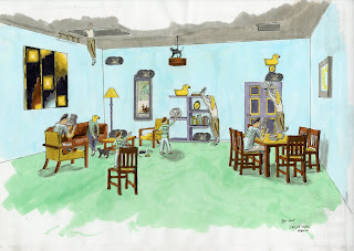
The Shag Space Composition
It was interesting finding a way to balance out my composition in terms of color and size hierarchies. I also found that in order to have certain pictures fit to my layout I had to stretch them a little bit. I wanted my black line perspective large because it has a lot of detail and is less readable without color.


Friday, September 25, 2009
Castle Preservation

I didn't want to tell the viewer which side the pilot is on by showing his tank's color. I showed the pilot touch on his objective: to protect the castle. The defenders also have a common insignia which looks like an orange and grey shield.
I practiced a lot of drawings in my sketch book for rendering the hand, the tanks and the commander's face. The biggest success of this project was how much my rendering skills increased as well as bringing me out of my timid use of markers.
Wednesday, September 23, 2009
Cartoon Time!

I wanted to emulate the cartoony style Shawn showed us. I took the paintbucket tool and changed the colors of the walls, ceiling, people and some of the furniture. I loved how I didn't have to draw a box around everything I wanted to color; Photoshop just knows! Even though this worked well it would paint the shadows a different color from the color I wanted. This was kind of weird and frustrating. I decided to get the shadowed areas as close as possible and just shadow them again with the burn tool. I was pretty satisfied but I decided to exaggerate the colors more so pulled the hue back.
Gettin' More Professional

I decided to take some of Suzanne's criticism about my gray shadowed carpet and change it so it looked more natural. I got rid of the old shadows under all the furniture and on part of the wall by using the clone stamp to clone the same carpet color over the shadows. I then used the burn tool where the old shadows were and made more realistic dark green shadows. I also used the burn tool on the lamp and on the corners of the walls. I lightened the wall under the lamp and I lightened the ceiling above the ceiling light.
The Clone Tool!

For my first photoshop experience I decided to take parts or components from my perspective and place them in other places. I used the clone stamp tool and it seamlessly allowed me to copy and paste people and things in new places like they were components out of sketchup. Putting the boy on the chair was fun because I first cloned the chair, then the boy and then I "recloned" the back of the chair so the boy's legs wouldn't overlap the chair.
Tuesday, September 22, 2009
My Final Color Study Perspective
My 3 Color study spaces


 I picked some outrageous colors: green, yellow, blue and brown. It was tuff figuring out what to color first as in the furniture, people or walls. My favorite is the top perspective as it is very bright and seemingly spacious. Also the paper I used (parchment?) didn't saturate with color and allowed me to wipe color away to simulate light.
Wednesday, September 16, 2009
Gatewood Structure perspectives
Gatewood Black and White Structure
Monday, September 7, 2009
Maud Gatewood Studio Project
Our first project of the year challenges us to pick a painting by Maud gatewood and then use it as inspiration to create a temporary structure on the UNCG campus.
Subscribe to:
Comments (Atom)


