Monday, December 21, 2009

The Gentlecat


I was looking up funny shirts for my brother when I came across the above (black and white) shirt design from zazzle.com. This shirt really captures the wisdom cats have in their eyes so I made my own cat people. My mom and I love cats (She has 6 or 7!) so these will be a great presents for her too!

Cat-people scale figures here I come!

Saturday, December 5, 2009

So You Think You can Draw CD Cover Montage


Creating a story/illustration linking four totally different stories/illustrations was very challenging and fun. I have to give credit to the cover art of Blade Runner and artist Syd Mead as it was what I drew inspiration from. The most challenging aspect was in creating two different ground planes and making one turn into the sky of the other.

Wednesday, November 25, 2009

Materials Study


The above materials are for my Stephen Hawking kitchen design. Each material is rendered in pencil, pen and pen and marker. They are (from left to right) ultraglas, scintilla tile, kirei board and paperstone. These things were uber time consuming

Across The Street From Fishbones


This was a sketch from the Fishbones restaurant patio looking across the street at the "Filling Station" restaurant. We were there with some old hippie friends of my dad. My father's friend Danny told us about the time he and a friend raided a farmer's "mushroom" patch and were shot at. They lived.

Haybles Hearth


This is my dad's favorite restaurant. It seems to be one of the last hole- in-the-wall places left in Greensboro. Great home-cooked food and friendly folks!

Communications Class Speeches 2

It's really funny how when you draw someone (whether it truly looks like them or not) you can really see how long or wide their face is. I also feel that in each of these drawings I have captured the essence of each person. Some are shy and nervous while others aggressively bloat out what they have to say.

Stephen Hawking Kitchen Practice Perspectives


These perspectives helped me a lot with figuring out the color scheme I would use on my final perspectives. I also got to practice drawing Stephen Hawking. I wanted to make sure that it didn't seem like I was trying to make him look funny, and to make him seem like a part of the space as if he is part of the design.

Stephen Hawking Construction PLan

Thursday, November 19, 2009

Final Foods Lab Compositions


These are my compositions for my final presentation to the nutrition department. Stephanie told me to incorporate my tectonic logo into my final presentation (not foods lab) and since I was excited for logos, I decided to create logos for my Foods Lab compositions. I created hands and fingers that are stuck to each other to relate my beehive concept without creating a literal beehive logo. The fingers represent community relating to the mass of bees that populate a beehive. When the bees are in the hive they cannot fly but they still work very efficiently. I attempt to illustrate this with the logos in that the hands are capable of constricted but efficient movement as well. This is not to say that my proposed space is constricted but to relate to one characteristic of the beehive community.

Tectonic Face


When I was sitting at my desk mid Saturday the sun was beginning to set behind me. My laptop sat in front of me on my desk. I looked up and in the dark screen I saw my face in a half silhouette. I've seen it many times before, but this time the light and angle was perfect to where my face was seemingly divided in half. I dropped what I was doing and sketched it out for fun. Later on I decided I could modify it to work with my current studio design concept of "Tectonic" and turn it into a logo for the "So You Think You Can Draw" contest.

We had a class vote for the logo contest, and guess what?..
I won!


Wednesday, November 11, 2009

The Sky Tower


Tectonic Composition


A point of impact breaks plates. The plates shift and where they shift and break light is created. The idea of light and weightlessness coming from such a dark, compact dense place is what I play my concept on. My kitchen space contains fragmented elements, these elements in their seeming shift make the space seem automated, progressive, and dramatic as if it is changing and going somewhere.

Thursday, October 22, 2009

Foods Lab Perspectives


I made perspectives by taking pictures of the physical model I made. Each of the pictures are actually panoramic views made up of 5 to 6 different shots. I used the photomerge in photoshop to create the panoramic views. to do the rendered perspectives I traced the pictures and then added new people, entourage and an outside desert scene. I love the desert and whenever I do perspectives with windows I like to show desert elements to spice things up. The perspectives are also very useful in showing the wide-angle lens (positioned above the instructor station) which looks down to show the instructor's demonstration.


Venus Man Trap


I've always had a fascination with Venus Fly Traps and now that I have 2 plants at my desk window I look at them all the time. All the girls come by my desk and poke at them and act like they're scared. It's fun to imagine that the plants could grow large enough to eat us. They are also very interesting to look at in that they don't just grow straight up like most plants, they twist and turn and even lie on the ground.
While doing this project I looked at them straight on to capture the twisted extreme positions they get into. It works out well for the story I'm creating because these twisted positions make them appear to be moving, as if they are poised for attack.

Wednesday, October 14, 2009

Sleepless Night

A few nights ago I woke up in the middle of the night and couldn't get back to sleep. I turned on my little light and sketched the iron and the shirt sitting on my dresser. Sitting in that position up against the wall made my back hurt, so once I was done with the drawing I went to sleep pretty easy.

Kinsey Jones

I got to draw Kinsey on draw your-neighbor-day! I got her to look at the window and look pretty and my hands did the rest. Too bad I kind of made her look scared.

Thursday, October 8, 2009

Junk Truk

I was waiting for Buiscuitville to open one morning so I decided to sit in the Office Depot parking lot across the street and draw this junky truck that was for sale. I decided to use my newfound pen shading technique. By shading the ground below, I kind of fixed my mistake of making the back end higher than the front. It looks like the truck is moving down a downward slope.

Tommy and Suzanne at The Green Standard

It's fun to watch people. Tommy moved around a lot and constantly put his arm around the seat next to him. Everyone has an animal that they look like- The way Tommy moved his head back and forth and the way his lip connects to his nose made me come to the conclusion that Tommy is a lizard. Because Suzanne sat in front of me I could only watch her out of the corner of my eye, she looked down a lot because she was drawing little caricatures of herself, so unfortunately I was unable to capture her true beauty or find her animal.

Texture Study


This is the texture study from class. By accident I learned how to do a light shading with pen! Because I was using a .02 micron, I turned it to its side like a piece of charcoal almost so it couldn't mark and it began to shade like a pencil! This was so cool I shaded the whole piece of wood with this technique.

Assorted Judiths 2

Rendered Entenza Plan

Thursday, October 1, 2009

My Hand

The hand in my castle is very large so once again I needed to practice in my sketchbook before doing the final thing. Once again I used the beige marker with warm grays to create shadows and curves. I used a white color pencil to give light to the top areas of my hand and arm. I also practiced a small mechwarrior below when I was trying to figure out color schemes for the different mechwarriors in my castle.

Shadowcat

This is a mechwarrior I practiced in my sketchbook for my castle project. Because it was in my sketchbook I wasn't scared or timid about taking risks with the markers. But as it turned out the risks paid off and this really got me to love markers instead of just watercolors.

Assorted Judiths

Drawing someone multiple times is helpful to understand spacing of different features of the face. I later used this to practice rendering for my castle project. With the two faces to the left I used the actual "flesh" labeled chartpak marker. But I found beige with warm grays for shadow and value to be the best marker for skin though it does turn out a little dark. Don't worry, I do take notes during class these are compiled from multiple days.

Monday, September 28, 2009

The Shag Space Composition

It was interesting finding a way to balance out my composition in terms of color and size hierarchies. I also found that in order to have certain pictures fit to my layout I had to stretch them a little bit. I wanted my black line perspective large because it has a lot of detail and is less readable without color.


Friday, September 25, 2009

Castle Preservation


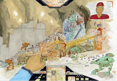
I wanted to create a sense that we are viewing the distant future with an ancient fortress that has been retrofitted with technological enhancements. You are a pilot and you are walking on to the scene of attacking forces. The cockpit has all sorts of screens and lights to reference the status of your walking tank. Cars are fleeing from the fortress as the palace guard tries to defend. One of the tanks' legs is destroyed while shielding a bus. The screaming commander and the moving sign attached to the fortress promote a sense of urgency. There is also a sense that these are not the only attackers; the battle continues in the background as smoking skyscrapers have clouded the sky.
I didn't want to tell the viewer which side the pilot is on by showing his tank's color. I showed the pilot touch on his objective: to protect the castle. The defenders also have a common insignia which looks like an orange and grey shield.
I practiced a lot of drawings in my sketch book for rendering the hand, the tanks and the commander's face. The biggest success of this project was how much my rendering skills increased as well as bringing me out of my timid use of markers.

Wednesday, September 23, 2009

Cartoon Time!


I wanted to emulate the cartoony style Shawn showed us. I took the paintbucket tool and changed the colors of the walls, ceiling, people and some of the furniture. I loved how I didn't have to draw a box around everything I wanted to color; Photoshop just knows! Even though this worked well it would paint the shadows a different color from the color I wanted. This was kind of weird and frustrating. I decided to get the shadowed areas as close as possible and just shadow them again with the burn tool. I was pretty satisfied but I decided to exaggerate the colors more so pulled the hue back.

Gettin' More Professional


I decided to take some of Suzanne's criticism about my gray shadowed carpet and change it so it looked more natural. I got rid of the old shadows under all the furniture and on part of the wall by using the clone stamp to clone the same carpet color over the shadows. I then used the burn tool where the old shadows were and made more realistic dark green shadows. I also used the burn tool on the lamp and on the corners of the walls. I lightened the wall under the lamp and I lightened the ceiling above the ceiling light.