Monday, December 13, 2010
Parrish Wine/Residence Finalized Design
The wine bar and the above residential spaces were generated in response to the organization and living habits of downtown Durham, NC. Within the downtown organization, one’s home is clustered amongst restaurants, bakeries, salons, and galleries, all of which are footsteps away. A similar approach has been taken with the open floor plans whereby rooms and functions are blended; each sharing one footprint, generating a spatial identity within home and utility.
Much like the revitalizing process taking place in downtown Durham, components of the space are designed to soften industrial qualities through an exploration of urbanizing nature. The visual weight of distressed woods is brought to modern standards through the sleekness and utility identified with the urban setting. Perspectives, like that of the outside environment are interrupted but never broken as space-defining components seek to filter space rather than define it.
Central Regional Hospital Finalized Design
The elements fundamental to the healing system: familiarity to a child’s home environment, comfort, as well as providing some sense of growth and connection to the outside universe direct the design proposal for the Child and Adolescent Unit of the Central Regional Hospital.
The design concept is based on the moment under a shade tree: the revitalizing sensation one experiences while lying on fresh green grass, patches of dirt, encircling roots and a cool earthy scent in the breeze. The proposed spaces comprise this moment through components that influence, connect and govern each other
Friday, November 5, 2010
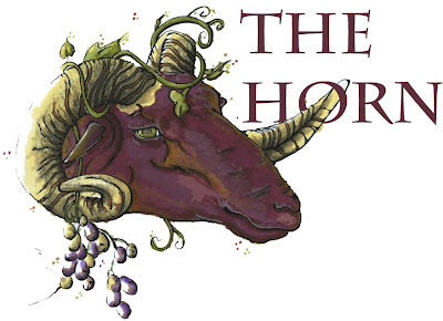
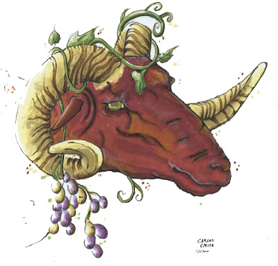
Ram of Grapes


How else might we brand our wine bar but with the Ram of Grapes. Since our wine bar is to be named "The Horn" by the client, finding a creative way to brand a horn with some personality was fun. My first iteration was the red one, but due to some feedback I learned that he may look a little like the devil or like he's been skinned alive. I tried to soften him with some color pencil accents, but ultimately decided to do another rendering (thank God I scanned the black line drawing) in a more purplish tone.
Sunday, October 31, 2010
Fun Draws From Class


Parrish Wine/Res Schematic Design


These images are some initial sketches and spatial diagraming regarding the wine bar and residential spaces.
Downtown Durham Wine-bar/Residence Reinvigoration


Our third project is to design and create a multi use retail/residential unit within the historic building site of 106 Parrish Street. This project is part of the planned reinvigoration and economic development of downtown Durham, North Carolina. This building will complement the flavor of the emerging surrounding businesses. The first floor will feature a wine bar/ retail space tailored the local tastes of downtown Durham. The second and third floors will be made up of four residence/apartments each complete with kitchen, bed room, laundry, bathroom, and living space units.
I am tackling this project with my talented classmates, Felicia Dean and Ino Loloci
Tuesday, October 12, 2010
Wednesday, September 22, 2010
Central Regional Hospital Design Development One


I based my concept on the moment of the shade tree. I look to the shade tree for the revitalizing moment one experiences while lying on fresh green grass, patches of dirt, encircling roots and a cool earthy scent in the breeze. The proposed spaces are to comprise this moment through components that influence, connect and govern each other.
The existing group room is primarily white, composed of a television amongst multiple chairs and tables. This perspective exemplifies my concept through the central unifying element “the plant slant;” systems of the room reverberate and connect to this element, other systems continue the connection, thus generating a network comparable to the roots, the grass, the dirt, and the atmosphere of the shade tree. A subtle division of space is created along with a slanted planter for fine grasses. On either side of this divider is a tabled area with chairs and a wall mounted television. The other side features built in seating and a comfort circle for cushions and pillows. On the right of the room is the “Art Aedicule” which is at such a height that children may post and observe their art at any angle desired. Patches responding to the central space litter the floor, among them are chalkboard painted patches for decorative expression.
The patient room features more cove lighting centered on the modular bed and storage units. The storage and bed are modular in that they do not reach the walls so that they can be arranged and placed in any patient room. The curve motif shown in hallway elevations is used as a way-finding element to identify individual patient rooms. This curve then transforms into an overhead light and art display above the built-in bed nook. A camera/kaleidoscope light display allows for calming intimate atmosphere when the patient/client may feel agitated or uneasy while providing an inconspicuous mode of observation.
Lighting:
The existing fluorescent bulbs are very direct and harsh on the eyes, and the reflective white floors only work to increase the intensity. Much like the "Spine" corridor that runs the whole hospital, I would like to use cove lighting on the edges of the ceilings to create a softer space. In many of the spaces with windows to the outside I have slanted the ceiling so that light seemingly explodes from windows enlarging spaces.
Materials:
Natural materials are important in that they establish a connection to nature allowing the client a connection to the universe as well as for their abilities in reacting to natural light. For example use of sandstone flooring will be placed where sunlight meets the floor most prominently. Walking barefoot on warm sandstone as I did during a class trip to India was an experience in itself entirely different to what one might compare to warm cement. Having a multi-textural experience seeks to offset the regimented order that may ensue from such an institutional space. Cool blue Terazzo flooring will make up the rest of the space. Accents of walls and storage components will be made of pale species woods. Long dark heavy timbers stretch along walls providing support for and influence on various systems.
The shade tree informs our deepest need for acceptance, yet despite all of the dirt and hard roots, it is all seemingly clean and harmless. A focus much like this must be taken with the facility as such regimented institutional practices may potentially suppress our creative, inquisitive minds to further disorder.
Friday, September 17, 2010
Central Regional Hospital Peer Evaluations
Thursday, September 16, 2010
CRH Design Schematic


